
Historic Postcards Explore New Year’s from NY to Europe: Preserving The Lost Art of Postcards
Views: 537
By Michael Perlman
A new pyro display ball will soon drop in Times Square, ringing in 2026, but in order to look forward, the spirit of our ancestors comes alive first, offering lessons in cultural history and art. Most New Year’s postcards are colorful lithographs that seem realistic, or real photo postcards with hints of hand-coloring. A majority were published between 1898 and 1918, and those from the 1920s to the 1940s appear in fewer quantities.
Several decades ago, this unique form of art and communication was available at your corner pharmacy, but today they are being rediscovered on eBay, and at estate sales and postcard shows by the Metropolitan Postcard Club in Manhattan. Nearly every theme is represented, including hometowns, holidays, hobbies, romance, and humor. In 1873, the first American “picture postcard” was designed. Today, a significant number of postcards of the late 19th and early to mid-20th century exist in an excellent state with expressive penmanship, a one-cent stamp for domestic mail, and two cents for international. Deltiology is the collection and study of postcards, deriving from “deltion,” a Greek term for a writing tablet or letter. A postcard collector is a deltiologist.
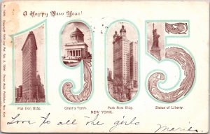
A New York City theme is portrayed in some postcards. One celebrated innovative and ceremonial buildings that became instant landmarks. A postcard recognizing the approach of 1905 features photos of significant landmarks; the Flatiron Building, Grant’s Tomb, Park Row Building, and the Statue of Liberty within large block letters of the year, and is adorned with Art Nouveau vines. The wedge-shaped Flatiron offered a pioneering steel frame and was among NYC’s tallest skyscrapers in 1902. The 30-story Park Row Building was the tallest office building worldwide, and the city’s tallest from 1899 to 1908. This postcard was copyrighted in 1903, patented on February 2, 1904 and published by Franz Huld of 246 Fifth Avenue as part of Volume 1905. Huld is remembered as a significant American publisher of souvenir postcards who experimented with views, expositions and patriotic postcards, comics, and novelties. Among his best series is “Famous Views of America.” Earlier on, the postcard trade was largely based in Germany and Holland.
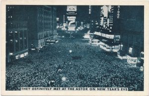
It is all eyes on Times Square in a selection of postcards. A white border postcard features a black and white printed image of shoulder to shoulder attendees. It is captioned, “They definitely met at the Astor on New Year’s Eve.” It was photographed from a once ornate Times Building and faces the Studebaker Building. Art Deco neon signs were in full swing. A Chevrolet illuminated sign reads 12:00. To its left is the world-famous 1,000-room Beaux Arts style Hotel Astor, which operated from 1904 to 1967. Time Square became the scene of New Year’s Eve celebrations as of 1904. The first ball drop, which dates to 1907, was erected by New York Times publisher Adolph Ochs.
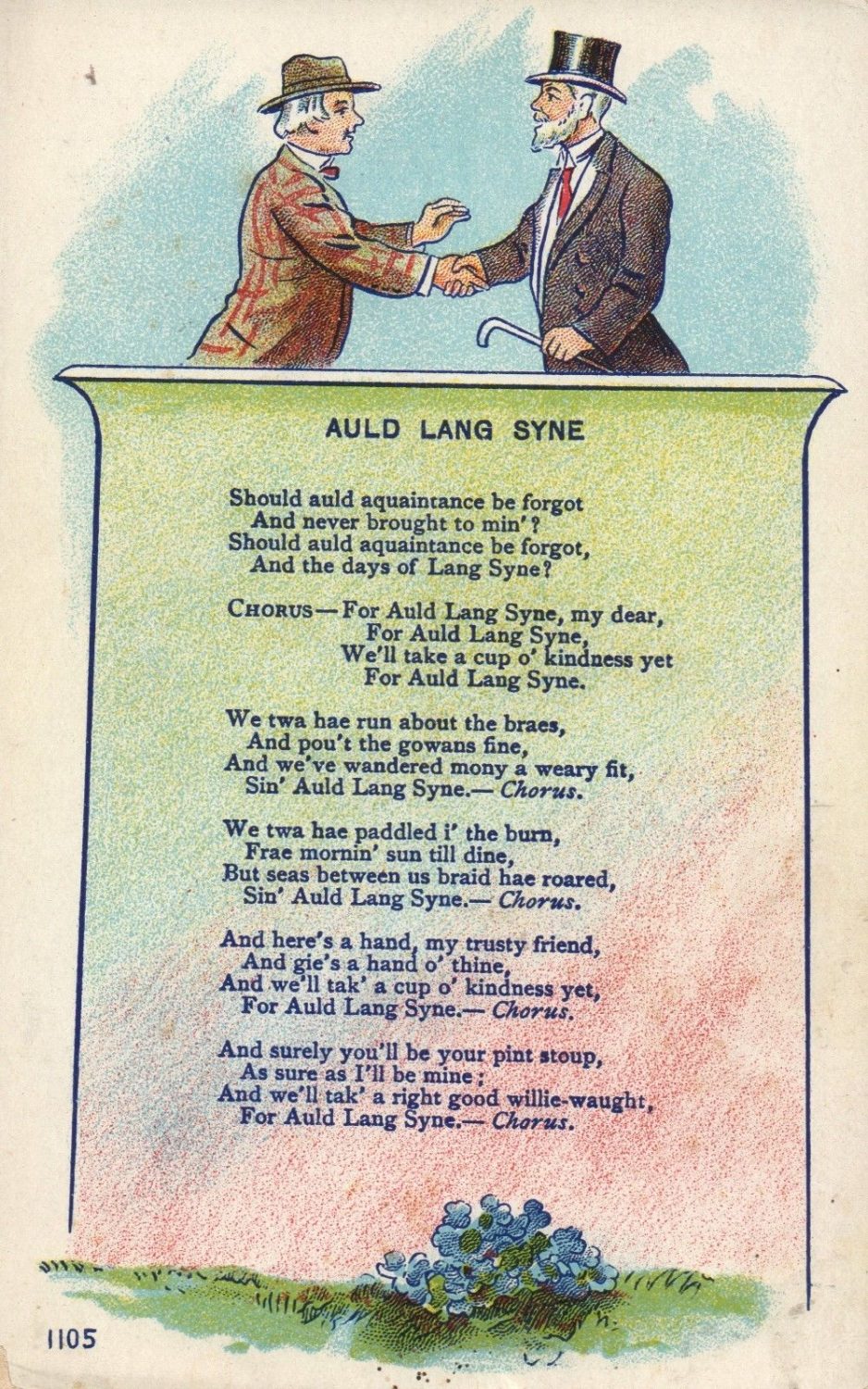
It becomes a musical production on an “Auld Lang Syne” postcard featuring the Scottish song that bids farewell to the old year and is interpreted as a call to remember long-standing friendships. It features the complete lyrics on a banner with a watercolor background, and two men on top wearing suits with a top hat and a traditional hat, shaking hands. Robert Burns wrote the poem in 1788, and then in 1799, it was set to the traditional pentatonic tune. The phrase was featured in earlier poems, such as that by Robert Ayton (1570 – 1638).
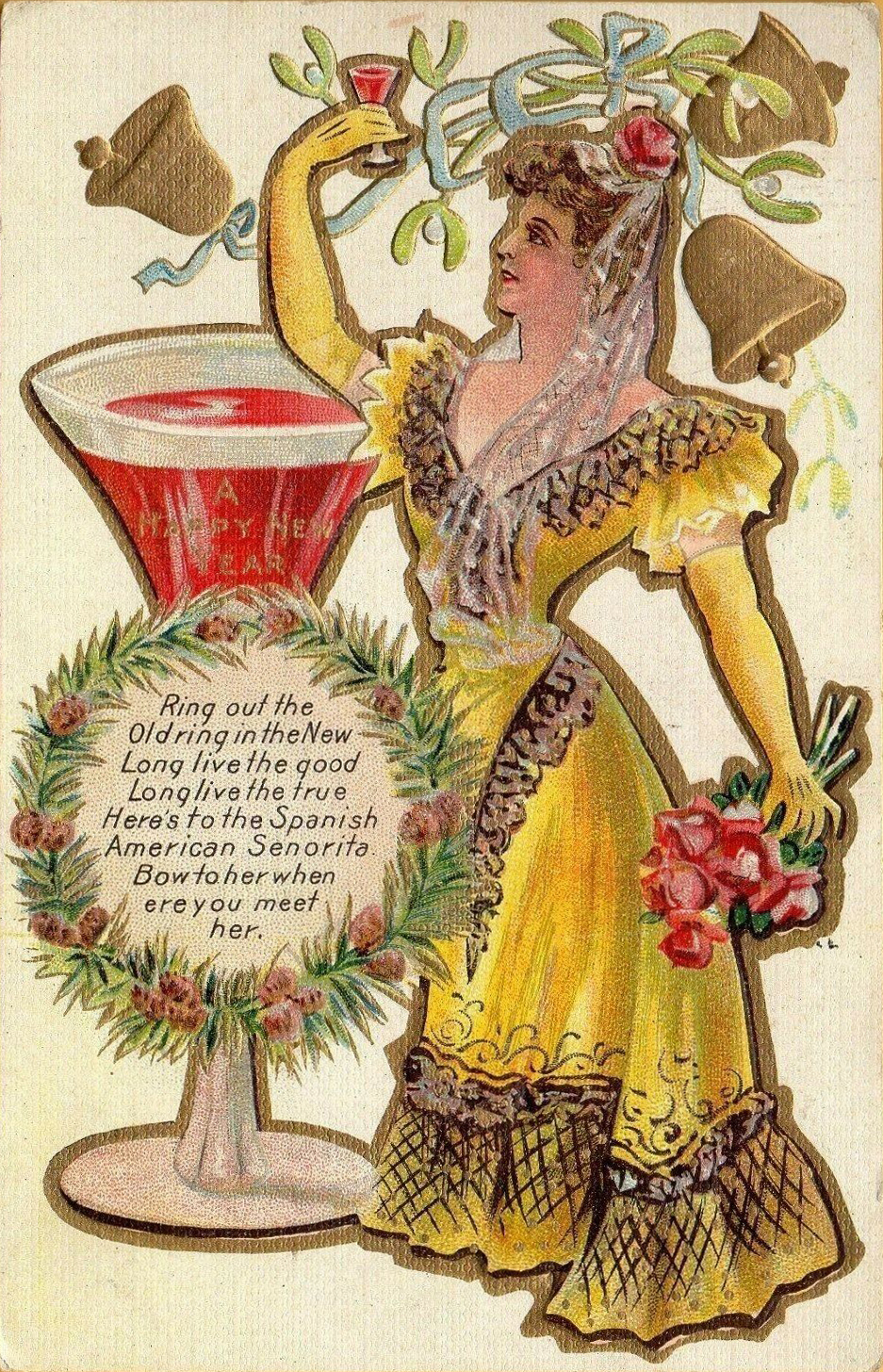
The circa 1910 to 1918 “New Year Toast Series” of postcards featured hand-colored fashionable women spanning various ethnicities. Among them were the Spanish American señorita, French American free viva! viva! bon ami, American Italian girl, German American, and Irish American lass, who appeared alongside gold or silver bells, a wreath bearing an inspirational message, and champagne or wine glasses. It featured Edwardian and Victorian dresses. Illustrations were embossed, enabling an interactive, true to life feel. Although the concept of toasting is a prehistoric ritual, the term “toast” can be traced to 17th century England as it applied drinking to the ladies. In the 18th century, it became a tradition to place toasted bread inside a cup.
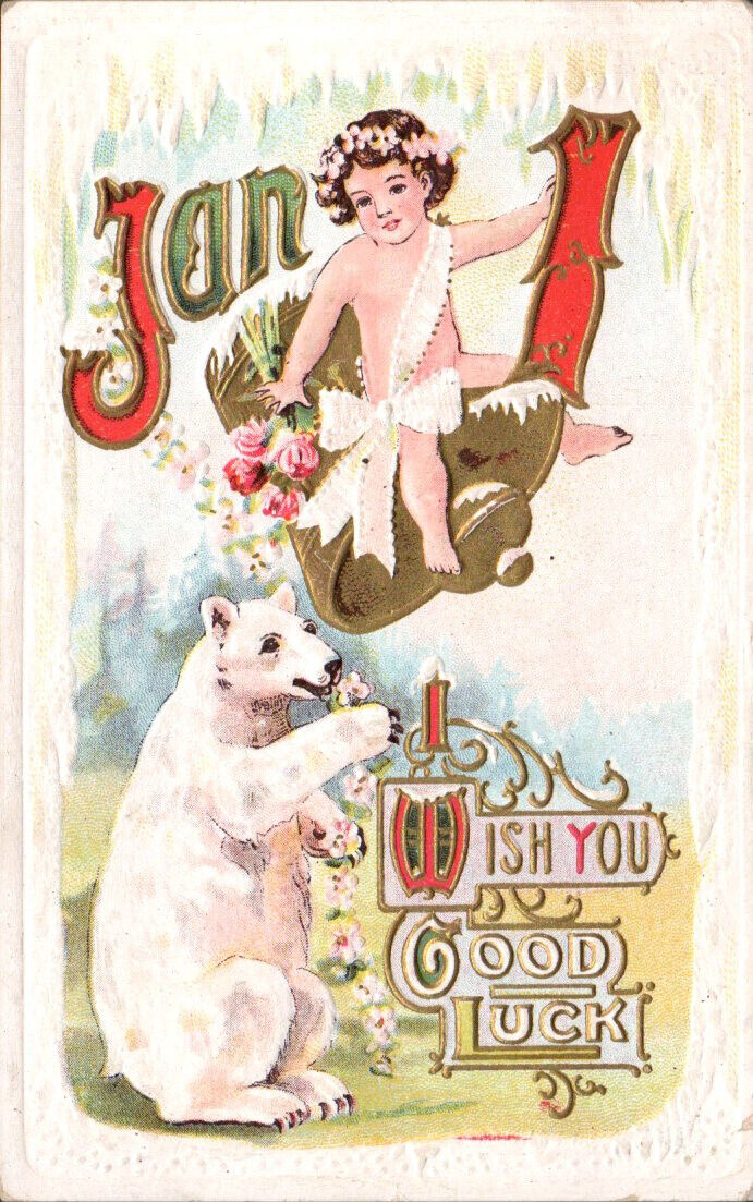
A sash and flower adorned cherub swings on a bell to ring in the New Year, where Art Nouveau calligraphy is embossed and gilded. A polar bear relates to the wintry ambiance, as icicles dangle, serving as a creative border. This circa 1910 postcard is part of Series 1002 by Midland Publishing Company, which was located at 118 East 16th Street in Manhattan. The firm was recognized by The American Stationer publication as an art publisher in 1913. In September 1913, The Post-Star published “From Salesman To Post Card King,” which referenced how he founded a publishing company and began by working on commission. An excerpt read, “Frank W. Hyman, president of the Midland Publishing Company, among the largest manufacturers of the higher grade of post cards in the United States, has succeeded because he had enough faith in his business to stick to it after others advised him to get out because he was dealing in a novelty.”
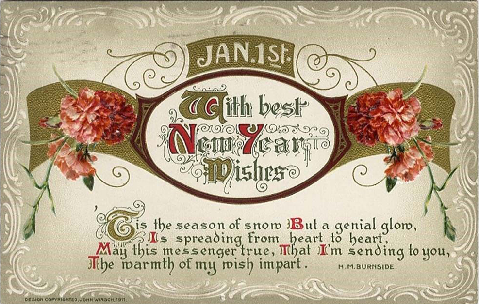
Poetry and inspirational quotes can be found alongside salutations on postcards. One of the most attractive Art Nouveau postcards features ornate calligraphy and carnations that become part of the gold leaf scrollwork. A red carnation symbolizes deep romance, whereas a pink carnation is symbolic of a mother’s love. In all, they are “Flowers of the Gods” that signify captivating charm and devotion. The elegant design was copyrighted in 1911 by John Winsch (1865 – 1923) of Stapleton, New York, who was co-manager of Art Lithographic Publishing Company. He copyrighted his artist signed greeting cards, where many were published in sets, and produced approximately 4,000 designs between 1910 and 1915. He was also acclaimed for his Thanksgiving and Halloween postcards. In addition, he used European artists, who worked with his German printers. Winsch postcards sometimes evoke Edwardian romanticism.
Some of his postcards feature poetry, as evident by H.M. Burnside’s poem about the warmth and love that glisten despite cold snowy days. Her name accompanies her poem, and is short for London native Helen Marion Burnside (1841 – 1923). At 13, she lost her hearing to scarlet fever, but found peace of mind by creatively expressing herself through thousands of poems and verses, and preferred being regarded as a verse writer. As an artist, she exhibited at the Royal Academy and was a designer for the Royal School of Art Needlework.
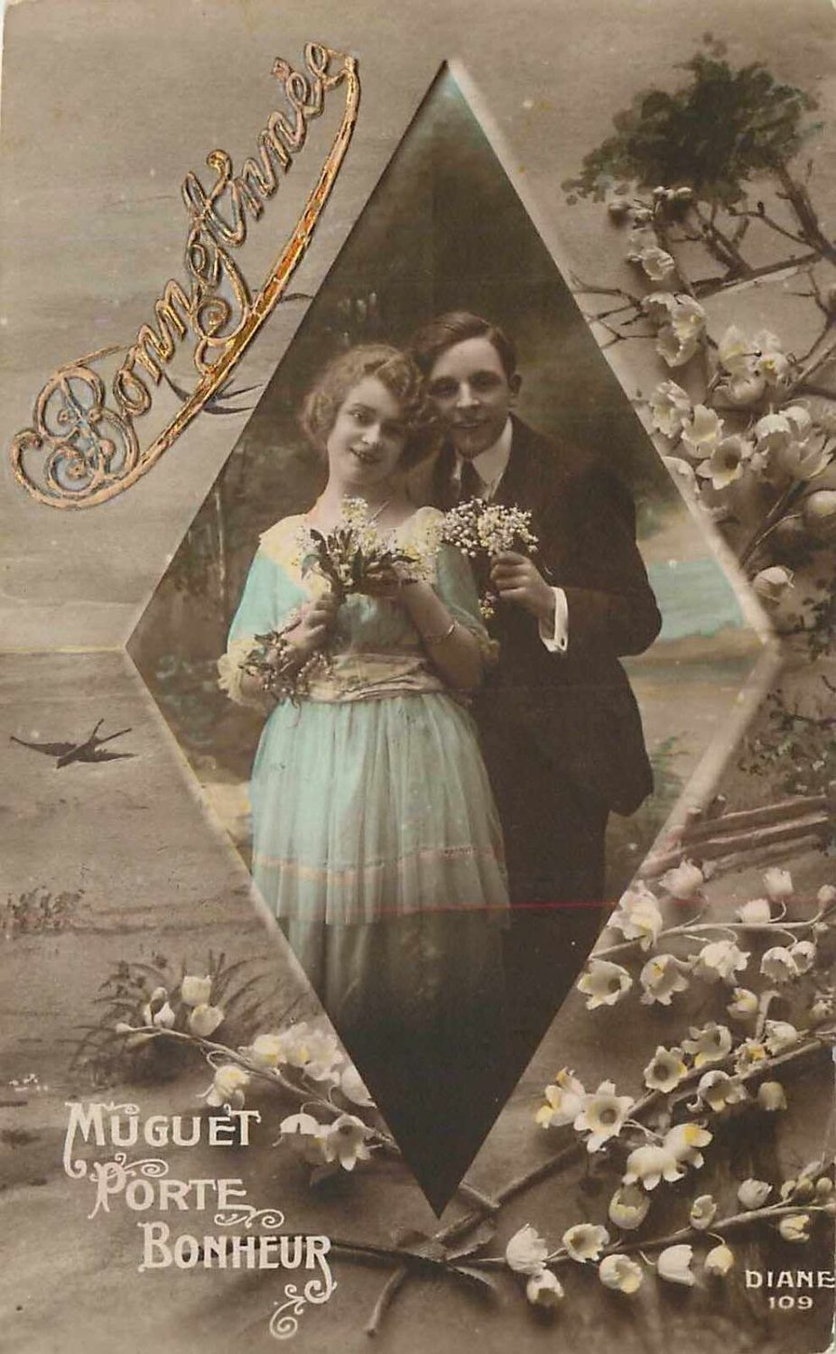
Real photo postcards, with color-tinted highlights of an image, were often dominated by a sepia tone finish. It was rare to find the same couple or a group of children featured on other postcards of its kind. These postcards usually offer an ornate ambiance and one-of-a-kind calligraphy, such as in a gold script-like Bonne Année postcard, where a couple poses inside a diamond vignette, an example of a photo within a photo. The viewer can encounter the serenity behind natural beauty, an ideal setting for timeless romance, and acquire a taste of Victorian-era fashions. Unlike completely illustrated postcards, these cards feature images of real people, often taken in a studio, accompanied by a European setting. “Muguet Porte Bonheur” is French for “Lily of the Valley, Lucky Charm.” The postcard is marked “Diane 109,” which is believed to be a series number. The reverse is marked Levallois-Perret, a commune in France, with the initials E.P.B. preceding it, which was associated with other glamorous photographic postcards.
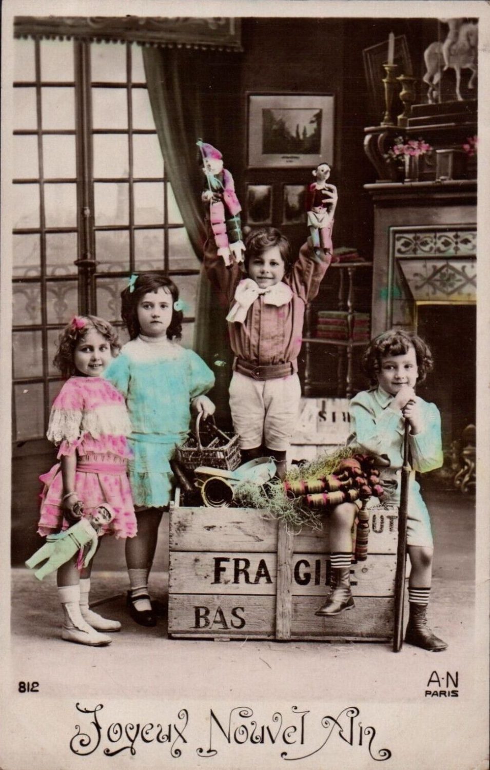
Adhering to the French theme is a circa 1911 tinted postcard that features a group of Edwardian style children holding puppets and dolls. An elegantly inscribed “Joyeux Nouvel An” translates as “Happy New Year.” Children dressed for the occasion, and senders were ready to relay a message of timeless pleasures to the recipient. It is initialed “A.N Paris.” This takes the viewer into the life of Armand Noyer, a photographer and postcard publisher who operated the Noyer Studio on Boulevard de Strasbourg in Paris, which existed circa 1910 through the 1940s. He was recognized for his halftone lithography and was a member of Salon de Paris.
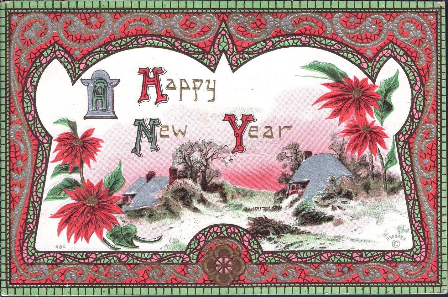
Among the most beautifully designed mosaic-inspired borders frames a snowy country village that evokes warmth, and is accompanied by poinsettias, symbolic of joy and hope, in addition to representing Christmas’ festive spirit. A dominant red and green consolidates the frame with the imagery. The circa 1910 postcard offers a delightful display of Art Nouveau with Medieval and Gothic influences. In each postcard of this series, the village scene varies, in addition to the scrollwork and color schemes of the mosaic frames. A bottom inscription pertains to P. Sander(s), a New York-based publisher who specialized in illustrated holiday postcards.